Medea / Jan Maertens: Difference between revisions
No edit summary |
No edit summary |
||
| Line 12: | Line 12: | ||
* I feel a particular tension installing itself when looking ahead towards a holistic light design: |
* I feel a particular tension installing itself when looking ahead towards a holistic light design: |
||
** The idea of a vast lanscape comes back regularly in working discussions, referring to Müllers "Landscape with Argonauts" and resulting in the pretty open set design consisting of a back drop / overall floor cover + a set of matching sheets and textiles / a standing giant flower at a back corner |
** The idea of a vast lanscape comes back regularly in working discussions, referring to Müllers "Landscape with Argonauts" and resulting in the pretty open set design consisting of a back drop / overall floor cover + a set of matching sheets and textiles / a standing giant flower at a back corner |
||
** The wish to isolate movement stills of a group of performers in a particular bold and directional light composition, referring to Caravaggio paintings, has been expressed often while rehearsing in the studio (with low winter sunlight breaking in:-) |
** The wish to isolate/accentuate movement stills of a group of performers in a particular bold and directional light composition, referring to Caravaggio paintings, has been expressed often while rehearsing in the studio (with low winter sunlight breaking in:-) |
||
** Given this in the rather basic technical frame (a 10/10/6m box with an audience pretty much upfront), i feel i will never be able to support purely one of the above "guides" without having to break all promises towards the other... hoping to find a intrinsic voice for the light to overcome a unique serving role to or the landscape visuals or dramatic bodily compositions - or worse, constantly having to compromise in both directions. |
** Given this in the rather basic technical frame (a 10/10/6m box with an audience pretty much upfront), i feel i will never be able to support purely one of the above "guides" without having to break all promises towards the other... hoping to find a intrinsic voice for the light to overcome a unique serving role to or the landscape visuals or dramatic bodily compositions - or worse, constantly having to compromise in both directions. |
||
Revision as of 09:20, 11 January 2022
Summary
By theater maker Piet Arfeuille (Theater Malpertuis, Tielt, Belgium), Jan Maertens is invited to create the light design for a new Medea. For his version of Medea, Arfeuille will start off from Heiner Müller's Landscape with Argonauts, while directing 8 performers and 1 actrice in a "lively painting on movement and image". The set will be designed by Berlinde De Bruyckere. The performance is set to premiere in Tielt (Theater Malpertuis) on January 27th 2022 after which an extensive tour of the flemish CC's is foreseen. What follows is Maertens' diary of the working process focussing on the becoming of the light design and comments by his fellow reflecting light researchers.
Reflections
Preliminary thoughts
- Some restrictive issues for an all too extensive/specialised light design: the performance will need to be able to tour without any additional set up day and in a variety of theater dimensions / technical overhead (the Flemish CC's).
- As text will be very reduced, if at all present, and the narrative intensions will be taken over by the bodily presence/expression of a rather large group of performers (9 pax on a 10/10m performing area), i feel the light might, maybe even more than ever , need to take the role of the directing/focussing/zooming agent/camera for the audience.
- I feel a particular tension installing itself when looking ahead towards a holistic light design:
- The idea of a vast lanscape comes back regularly in working discussions, referring to Müllers "Landscape with Argonauts" and resulting in the pretty open set design consisting of a back drop / overall floor cover + a set of matching sheets and textiles / a standing giant flower at a back corner
- The wish to isolate/accentuate movement stills of a group of performers in a particular bold and directional light composition, referring to Caravaggio paintings, has been expressed often while rehearsing in the studio (with low winter sunlight breaking in:-)
- Given this in the rather basic technical frame (a 10/10/6m box with an audience pretty much upfront), i feel i will never be able to support purely one of the above "guides" without having to break all promises towards the other... hoping to find a intrinsic voice for the light to overcome a unique serving role to or the landscape visuals or dramatic bodily compositions - or worse, constantly having to compromise in both directions.
A first technical week in the theater: meeting the set
Unlike mostly, i have been able to take some time in the theatre and discover the set with lights before the rehearsing process with the performers continues to take place in it. A couple of technical days installing preliminary light ideas, trying out the above mentioned landscape qualities/potentialities of set&light and testing technicalities, leads me to the following observations:
- (technical) proportions and compatibility
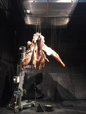
- having to give up light-rigging/focussing potentialities for a vast part of the technical ceiling in favour of set/construction ideas often leads to frustration... albeit not seldom leading to creative solutions. But what here initially is thought out as a conceptional idea to visually mark the hanging of the set (= giant standing flower-on-strings) literally comes, in my opinion, a little out of proportion (see image):
- a massive steel construction frame of 3by3m is installed just about 1m below rigging height, holding thin rigging ropes while emphasising the set-on-a-wire idea... be it there's strings for only 25% of its surface...
- I can understand the conceptual set-logic of implementing/lighting(through) this structure on/from a more operatic dimension, but working with nearly 1m distance for the lights hardly holds potentialities ... nor visually (boldly lighting (through) the frame), nor conceptually (imagining a minor pendant of the stage up in the air when it doesn't have any breathing space/height around), nor functionally (projecting the raster of the frame on the surface/objects/performers being lit-through)
- rather than a massive rigging structure blocking-rather-than-evoking potentialities for light, i will try and introduce a simple alternative for emphasising the hanging construction of the set: in stead of using thin black ropes (for hanging the flower) with very little contrast to the black backdrop, i will suggest a slightly stronger grey-contrast in the choice of rope... so the rigging of the set could be emphasised in a more proportional manner ... delicately lighting the set while emphasising the more contrast-ful rope
- having to give up light-rigging/focussing potentialities for a vast part of the technical ceiling in favour of set/construction ideas often leads to frustration... albeit not seldom leading to creative solutions. But what here initially is thought out as a conceptional idea to visually mark the hanging of the set (= giant standing flower-on-strings) literally comes, in my opinion, a little out of proportion (see image):
- (simple) quality of light
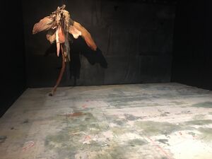
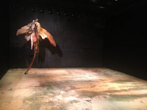
- Understanding the set (=floor and giant flower) as a conceptual unity, it is hard/harsh to not meet them in a full spectral light universe (see pictures)
- when applying just open white, and for the worse CTB corrected halogene light, i realise the very green colour-quality of the floor contrasting very much with the much more red colour-quality flower. Hard to realise them to make part of a unifying landscape
- when applying open fluorescent tube light, things start to look a little better when using the extremes in the available colour temperature gradient (3000°K and 8000°K)
- when applying a randomly focussed chaotic wash to the floor, i try to use a mixture of suggestive colour impressions (Lee 702/708/747) in order to overcome the harsh colour contrast while blending more or less the flower with the floor in a lively but unifying landscape.... now let's see how the performers will look like in this light:-)
- It is clear that all halogene light used here will need some kind of spectral correction, adding red and/or taking out green... or is it only the eyes of a light designer that cannot deal with oddly balanced quality of light(reflection)
- Understanding the set (=floor and giant flower) as a conceptual unity, it is hard/harsh to not meet them in a full spectral light universe (see pictures)
Incentives towards a preliminary light design
Observations & Feedback
...


